Design Philosophy Statement

Interior Design is present in everything, from residential to office designs. I first started getting interested in design in high school, and my curiosity has been growing ever since. My interest in design is focused on residential living areas, and how they can be transformed into new spaces simply by adding a splash of color or getting a new piece of furniture. I am constantly being inspired by things around me, such as buildings I see or even things in magazines. For my future in interior design, I want to design eco-friendly spaces that use natural materials and let in lots of light.

Wednesday, February 15, 2012

Romanesque Textile Pattern

Concept Statement: This design was based on the Romanesque style, and is comprised of images of Ancient Roman coins, tapestries, stained glass, and arches. The color harmony used was bright colors reminiscent of the era, such as reds, golds, blues, and greens.  These assist in keeping the pattern seem as if it is from the Roman era, and the colors all work together and blend well.  The contrast is also evident in the way that there are reds, greens, and blues on the textile, which are opposite one another on the color wheel.  The borders are horizontal and vertical, and the difference in opacity with the middle element also helps with contrast.  The textile seeks to incorporate unity and balance, with the outer borders connecting the print to the middle picture. The small pictures in the corners also offset the large image in the center.  Overall, the colors and placement of the images seek to encompass the overall style from the Romanesque period. 

Reflection: This image is composed of pictures reminiscent to the Romanesque time period. The border is comprised of typical Roman patterns, along with Roman coins and an archway. The middle image is of a stained glass window combined with an image of a Roman painting. I liked this design because of the way that the patten turned out when it was put together. I also liked the colors used, and how they work well together. My skills in being able to manipulate Photoshop images have grown, along with how to manipulate images using InDesign. Overall, making this design was a fun process and I was able to expand my knowledge to create a unique design.

Geometric Pattern

This design was composed in Photoshop, and uses images from the Romanesque time period. These were then manipulated and the colors altered to create a warm color scheme that also reflects that of the Roman era. I like this design, as it is simple (it is made on a square pattern) yet elegant at the same time. I think the ways that the pictures turned out work well with each other and complement one another. When creating this design, I learned more about how to use Photoshop, as well as how to manipulate images and putting them together into a pattern. Overall, this project helped me to grow in learning how to create designs and  prepared me for future projects as well.

Sketches


Value Study Using Line: This sketch is of the same room, one normal and one that is cast in shadow. Using high contrast methods, the light coming in through the window is shown using varying lineweights.


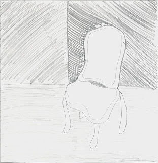
Chair Negative Space: This sketch is of a chair and is based around drawing the negative space around the chair, instead of the chair itself. It also used varying shades of pencil and line techniques.
Black Paper: This sketch was done on black paper using crayons and colored pencils. It shows hardware such as a doorknob and lock. It uses the technique of crosshatching to show texture and add depth. 
Figure Trace: This is a sketch that was traced over a picture using a single line. It seeks to show only the contour lines of the figure, not the figure itself. 

Fruit Sketch: This sketch uses the technique of cross hatching to show three different pieces of fruit. The outer and inner views of the fruit is shown, and color was added for emphasis.

Room Corner: This is a sketch of the corner of my dorm room, and uses diffrent hatching techniques to show shadow and shade. It seeks to show an interesting perspective of the corner of the room.

 Different Chair Views: This sketch reflects different views of the same chair, including perspective, top, bottom, and front. It also shows the material the chair is made of.
 Fruit Sketch: This sketch is of three different pieces of fruit sitting on a table. It uses cross hatching techniques to display the fruit, table, and background.
 Napkin Sketch: This is a sketch from a bird's eye view of the Stephenson tower, and a perspective view of my room. It was sketched in pen on a napkin, which gave the sketch an interesting texture.
Mind Map: This sketch is a mind map that centers around the central word: place. From this word, I expanded upon it and then drew pictures to add to the words. 

Reflection: My sketching process started out being fairly simple, using graphite and free handing the images. Since then, I have started using techniques such as cross-hatching and incorporating the use of color to bring more interest to the sketch itself.